Saturday 15 February 2014
Thursday 13 February 2014
Evaluation Links
Question 1:


Question 2:
Question 3:
Question 4:
Question 5:
Question 6:

Question 7:


Question 2:
Question 3:
Question 4:
Question 5:
Question 6:

Question 7:
Tuesday 11 February 2014
Final Audience Feeback
This is my final audience feedback needed for my evaluation and the overall opinion of the general audience about my magazine.
This presentation will exhibit the ratings for my final front cover, contents page and featured article pages.
This presentation will exhibit the ratings for my final front cover, contents page and featured article pages.
Thursday 6 February 2014
Evaluation Write-Up
- In what ways does your music magazine use, develop or challenge forms and conventions of existing music magazines?
Before creating my music magazine, I have researched the typical conventions of my genre – pop music. Since pop magazines are the magazines that are gaining attention nowadays, I wanted to develop the popularity of sub-pop culture such as K-Pop (Korea Pop) and J-Pop (Japanese Pop) to the UK music industry.
By considering the magazine convention of the pop genre, the font I have used is very creative and comic-like as this is the same font that the logo for “Power puff Girls”, a cartoon that presented girls as superheroes. The fonts I have used in the puffs vary from bold to thin sizes and this is because pop magazines usually present their main texts in a bold and eye-catching font to capture the attention of the audience. Be-bop! [ビバップ!], the title of my magazine is a kind of upbeat music with a fast tempo and combination of harmonic structure. The title is with the Japanese characters merged with the masthead shows the connection of it being a K-Pop and J-Pop magazine.
The buzz word “FREE” at the top of the page, below the title is one of the factors that make my magazine more appealing. Since, my magazine is the first edition and the artist I have presented is an upcoming artist, it is quite a disadvantage if it was competing with large fan-based pop magazines. So by giving the audience a “reward” or “price” with the buzz word “FREE” in bold and dark font, I have made the magazine purchasable.
The anchorage text however, is distinguished from the other fonts as the anchorage text defines and shapes the character of my central image. It reflects the artist’s style and personality, not the magazine’s nature. The pull quote on the anchorage text also reflects the artist’s personality and it gives the impression of humility and cheerfulness “To stand in front of the crowd is the best thing that’s ever happened to me… so far!” It also gives expectation from the audience and this is what pulls an audience of a pop magazine because popular music evolves every now and then and of course, the audience would expect more from upcoming artists such as REIKA.
The colour scheme I have used is black, white, pink and red. Black and white is the foundation colour scheme for any magazine. Pink and Red gives the distinction between a pop magazine and any other genre of magazine. Pink is a feminine colour and this adheres to my target audience which is 65% female. The red on the other hand adheres to the remaining percentage of my target audience which are male audiences. I have used this colour scheme throughout the front cover; contents page and double page spread so that the house style is consistent and a clear connection between the pages are presented.
On my contents page, on the other hand, the font style of the main title “Contents” is consistent with the font style and colour of the masthead and this is to show clear links between the two pages. I have divided the contents page into two columns to make it more presentable and professional. The font style and colour on the title of the article is the same font style and colour I have used for the puffs on the cover page and this is to adhere to the given house style which is introduced in the cover page.
On my featured article which consists of four pages in total which has page numbers 36 – 37 and 40 – 41 and the reason behind the gap is because adverts will be in the two-page gap. This is also to create the anticipation from the audience in reading the featured article. I have used consistent photos of my main artist for the cover, contents and feature article to familiarise the audience with the artist’s face, personality and style.
- How does your music magazine represent particular social groups?
My pop magazine, Bebop! represents the social group of teenagers and young adults who listen to pop music – mainly Korean and Japanese Pop. I have achieved this through the use of the informal language that teenagers in the status quo would use in their day-to-day interaction with other people. I have also shown this through the images and layout that was used which is common in pop magazines such as Top of the Pops and We♡Pop!
Bebop! also represented social groups between the gender and age.
To achieve these social groups representation of a pop magazine, I have looked at existing pop, K-pop and J-pop magazines and have researched about bands and artists that are really popular to the aimed audience. I have taken most factors from existing bands and artists that would attract the audience to the artists and this is to imitate the same atmosphere a pop magazine has and apply it to my product.
- Who would be the audience for your music magazine?
The target audience for the music magazine I’m making is very niche. It includes both male and female audiences mostly aimed towards Asian (other Asian and Chinese) ethnic group with the age bracket of 13-15 and 16 - 18. The bracket of 13 -15 are interested in music, Japanese animation and manga and the soundtracks that are included in the programmes. They are also engrossed with light and dainty music such as Vocaloid, a singing voice synthesizer that is very popular in Japan and is considered as a very light and cute genre of music that is presented in the programmes that they watch. In the 16-18 bracket, they are interested in music, Japanese animation and manga, and are more into a more mature kind of music that are being presented in the anime programmes and the songs of other artists in Japan and Korea as well.
The image and the artist that I have featured in my magazine – REIKA, aged 15 has the average age of my audience which ranges from 13 – 18 years of age and this is because the audience can easily relate to an artist of they were about the same age and this is another factor that would have pulled the target audience to my product. I have aimed the target audience to both male and female audience with the female audience prioritised as stereotypically; female audience would have more interest in pop music and celebrities.
The target audience are in the D and E socio-economic scale and this is because the magazine mostly aims at underage people which are unemployed and are in school. The audience also fit in the category of both Egoists and Drifters because the readers are young, indecisive and quite childish.
One of the reasons why I am creating this kind of magazine is because I personally love Anime soundtracks and Japanese/Korean music. Another reason is that many people support this kind of music, especially in the UK. For example, during comic conventions and Anime expos, many people attend these events because of their favourite bands, programmes and interests. Also, though it is a niche audience, I think it needs more supporters because I think many open minded people can appreciate this kind of music. There is also a very limited magazines that focuses on anime like Neo and MYMagazine but they mainly attend to the programmes and dramas itself and not on the music and soundtracks.
I have aimed it towards the Asian (other Asian and Chinese) ethnic group since my magazine is a UK-based magazine, not a single music magazine had aimed towards the K-pop and J-pop genre and since this type of music is now popular in the UK and the idea of a K-pop and J-pop magazine is very essential in promoting this type of genre.
In October 2011, London fixated itself on K-pop with tours from the three biggest groups such as 2NE1, Super Junior and Big Bang and more than 100,000 teenagers had attended this tour. The fan base of K-pop and J-pop music had become widely known from Asia to Europe and it is still growing in the UK.
- How did you attract/address your target audience?
I have used the buzz word “FREE” in the front cover and this is to give the sense of “reward” for the audience who had brought the magazine. I have also used the buzz words “Win!” and “…and more” to create the sense of anticipation and expectation from the audience which will draw them in. Also, by adding the “’YOU’ Section” on the contents page, the audience will be attracted to interact not only with the magazine staff and artists featured on each issue but also interact with other fans of the same genre. This is to make the audience feel important, noticed and involved in the “group”.
I have used the colour scheme of black, white, red and pink to attract both genders into buying the magazine. As mentioned before, red attracts male audience and pink attracts female audiences.
The font style I have used also is a factor for attracting the consumers. As I have mentioned before, the Powerpuff Girls font attract both male and female audiences as it pulls them back to their childhood.
- What kind of media institution might distribute your music magazine and why?
If I was to publish my magazine, the best distributor for this is the Bauer Media. This is because Bauer Media focuses mainly on both mainstream and niche audience and since my magazine has a selected and niche audience, my magazine would likely have to garner more attention as it is not in competition with other pop magazines. This is also because the pop sub-culture I am doing is unique. As stated before, despite the growing fan base of K-pop and J-pop in the UK, not a single music magazine specifically targets the audience for this genre.
Another reason that I have chosen Bauer media is because it has 19 million consumers per week in the UK. The magazine’s circulation in 15 countries is in total of 38 million per week. Though the Bauer Media Group has already a pop magazine – Q, Q magazine focus on mainstream pop music including miscellaneous features besides music such as film, television and lifestyle reviews while Bebop! (my product) will focus specifically on K-pop and J-pop music and culture.
“We connect people and communities with
compelling and quality content, whenever, wherever and however they want.”
Bauer Media’s statement of the ways they make people communicate through
magazine can be seen online. Since Bauer Media promotes the online processes of
their magazines, it would be very appealing to my target audience as the target
audience I have chosen for my magazine (13-18 years of age) and this age group
revolves mostly on the internet so the magazine would be easily promotable, accessible
and convenient for the target audience.
- What have you learnt about technologies from the process of constructing your music magazine?
In the process of creating my magazine front cover, contents page and featured article spread, I have used a series of programmes and equipment such as a digital camera, Adobe Photoshop CS6, Adobe Illustrator CS6 and social media sites like Blogger, Youtube and SurveyMonkey.
By using the digital camera, I am able to take pictures and check the outcome instantly. I could easily transfer the data I have taken with the digital camera to the computer and easily edit them or manipulate the photos with programmes such as Photoshop CS6 in accordance to my audience’s preferences.
Adobe Photoshop Creative Suite 6 (CS6) is a graphic editing programme in which I can manipulate images and create artistic media by the use of tools presented by the programme. In the process of creating my magazine, I have learned to edit an image. For example, removing the background and green screens and replacing it with a more appropriate background for the audience preferences using the Magic Wand Tool, Eraser Tool, Paint Bucket tool and the Gradient tool. I also utilised the Text tool and the Colour Swatches and Picker to manipulate texts and present my article in a more professional way. I also used how the gradient tool is very important in terms of creating the lighting in the images.
Adobe Illustrator Creative Suite 6 (CS6) is a vector graphics editor in which is widely used in terms of journalism and animation. By using the programmes ability to manipulate texts more thoroughly, I have used Illustrator in editing large quantity of text and used it in my featured article spread in which I have used the Text tool and the Text Wrap to make the article more efficient and legible for the audience to read. The Text Wrap allows the article to be wrapped around the image singularly so that individual changes would not affect any layers in the project.
Blogspot.com or Blogger is a blog-publishing service that allows multi-user blogs with time-stamped entries. It was developed by Pyra Labs, which was bought by Google in 2003. By keeping records and daily journals of the projects I have done, I can easily evaluate myself and see what I have done excellent and what I have done badly and create improvements for them. I can also easily keep track of my progress when I record a post and by creating a poll on the blog, I can easily access audiences’ feedback through this social media site.
Youtube is a video-sharing website on which users can upload, view and share videos. By using this social media sites, I had recorded my focus group and present creatively the data I have accumulated through Question and Answer and interviews from my target audience. And since it is found on the internet, it is very open to public and target audiences around the internet so it is very convenient in terms of getting feedback to improve my project.
SurveyMonkey is a web survey on which people can easily collect data through survey. Surveys are significant when you need to accumulate data and feedback to improve one’s work. I have used this site to gain criticism and opinions from my target audience and the general public and this is very helpful in developing my magazine. I could not have done my magazine and improved it without my audience’s feedback.
- What do you feel you have learnt in the progression from creating the school magazine (preliminary task), to creating your music magazine?
There is a clear distinction between my preliminary task and my final magazine. For my preliminary task, I had utilised more than 4 colour schemes which is engaging but quite confusing as the audience would not have distinguished the genre of my preliminary task. Meanwhile, my final magazine has used 4 colour schemes – black, white, pink and red and the audience would easily identify it as a pop magazine.
There is also a clear progression on how the images have been utilised in the magazine to make the appropriate theme for each genre. For the preliminary task, it is obvious that the potential of programmes have not been fully used while in my final magazine, I have used the Photoshop CS6 in the best of my abilities and give a more engaging and appealing results for my audience to enjoy.
Thursday 23 January 2014
Featured Article Spread Editing
These are some of the procedures that I did in the duration of this project. These are some images wherein I performed some edits to make it more appealing and look more professional.

Media Used: Adobe Photoshop CS6; Adobe Illustrator CS6
I have used the Paint bucket tool for the gray background and used the Gradient tool to add a shadow.

The black gradient relates to lighting of the photo. By using the magic wand tool and deleting the green background of the original photo, I had pasted the photograph to the background.

I have used the gradient tool to add a backlight to the microphone area.

I have used the gradient tool to add the pink shadow. This colour relates to my colour scheme. I had also used the Elliptical Marquee tool and used stroke and fill to create artificial camera flares and by changing the opacity, the colours I have used became lighter.

I have used the paint bucket tool to manipulate the colours of the name. I have also placed them in different layers so I can move the text to create the 3D effect.

By using the text tool and the rulers as a guide, I added my article for the artist "REIKA".

By using the rectangular marquee tool and copying the logo on the end of the page, the page adheres to the magazine housestyle and the consumer can create the link to the cover page and the feature article.

I have used the elliptical marquee and the fill and stroke function to create the bubble for the pull quotes.

I have used the Text tool to add the pull quotes and used the font type "Hobo" to make it more bubbly and appealing which relates to the personality of my new artist.
===============================================================
I have used the magic wand tool to delete the background and transform it into a transparent one. I also used the Clone Stamp tool to cover up the green bits left from the background on the hair.

I have used the Paint bucket tool to add the white background and the gradient tool to add the shadow on the background which affects the lighting of the photo.

I have saved the .psd (Photoshop) file and exported it to a .jpeg (Photo) file. I have inserted this in an .ai (Illustrator) file to add the article and create even columns.

In this part, I have created the columns and used the Text Wrap to make the text surround and follow the shape of my photo.

I have cleared the background of the image so I can still edit some parts in photoshop. By exporting the .ai file to a .png file, I can still manipulate minor adjustments on the background and gradients.

I have opened the file to Photoshop and changed the background to grey by using the Paint Bucket tool.
I have used the gradient tool to add the shadow.

I have used the gradient tool to add the lighting on the microphone which relates to my first few photographs.

I have used the rectangular marquee tool to create a rectangle and I have used the gradient tool to add a white gradient on the selected area. I have change the opacity to this gradient.

I have copied this rectangle and copied them into different layers. By doing this, I can change the positions and angle without affecting any of the unselected objects. I have used the text tool to add the pull quote.


The black gradient relates to lighting of the photo. By using the magic wand tool and deleting the green background of the original photo, I had pasted the photograph to the background.
I have used the gradient tool to add a backlight to the microphone area.
I have used the gradient tool to add the pink shadow. This colour relates to my colour scheme. I had also used the Elliptical Marquee tool and used stroke and fill to create artificial camera flares and by changing the opacity, the colours I have used became lighter.
I have used the paint bucket tool to manipulate the colours of the name. I have also placed them in different layers so I can move the text to create the 3D effect.
By using the text tool and the rulers as a guide, I added my article for the artist "REIKA".
By using the rectangular marquee tool and copying the logo on the end of the page, the page adheres to the magazine housestyle and the consumer can create the link to the cover page and the feature article.
I have used the elliptical marquee and the fill and stroke function to create the bubble for the pull quotes.
I have used the Text tool to add the pull quotes and used the font type "Hobo" to make it more bubbly and appealing which relates to the personality of my new artist.
===============================================================

I have used the magic wand tool to delete the background and transform it into a transparent one. I also used the Clone Stamp tool to cover up the green bits left from the background on the hair.
I have used the Paint bucket tool to add the white background and the gradient tool to add the shadow on the background which affects the lighting of the photo.
I have saved the .psd (Photoshop) file and exported it to a .jpeg (Photo) file. I have inserted this in an .ai (Illustrator) file to add the article and create even columns.
In this part, I have created the columns and used the Text Wrap to make the text surround and follow the shape of my photo.
I have cleared the background of the image so I can still edit some parts in photoshop. By exporting the .ai file to a .png file, I can still manipulate minor adjustments on the background and gradients.
I have opened the file to Photoshop and changed the background to grey by using the Paint Bucket tool.
I have used the gradient tool to add the shadow.
I have used the gradient tool to add the lighting on the microphone which relates to my first few photographs.
I have used the rectangular marquee tool to create a rectangle and I have used the gradient tool to add a white gradient on the selected area. I have change the opacity to this gradient.
I have copied this rectangle and copied them into different layers. By doing this, I can change the positions and angle without affecting any of the unselected objects. I have used the text tool to add the pull quote.
This is my final feature article spread page for my Bebop! Magazine with the improvements made and the feed backs take in consideration.
Contents Page Editing
These are some of the procedures that I did in the duration of this project. These are some images wherein I performed some edits to make it more appealing and look more professional.
Media Used: Adobe Photoshop CS6
 This is the draft for my contents page.
 By using the Text tool, I have change the purple shadow to pink so that it adheres to the colour scheme and house style of my magazine and genre.

 By using the magic wand, I selected the green areas and deleted them.

In the settings, I have made the background transparent so that I can replace the background with a more suitable colour for my magazine.

By manipulating the brightness and contrast of the image, I had made the image look more professional and lively to engage the audience more.
By using the Paint bucket tool, I have change the background to white and by using the gradient tool, I had added the gradient effect of the colour black to add to the natural shadown of the image.

By changing the brightness and contrast of the image, I made the artists and the background look more vibrant and lively which links back to my genre which is pop - vibrant and lively music.

This is the result.
By copying the image to a new .psd file, I can manipulate the colours and edit the background.


By using the rectangular marquee tool and copying the photos to the file (Ctrl + C), I have replaced the photos in my draft with the photos I have edited.

Media Used: Adobe Photoshop CS6
EDITS ON CONTENTS PAGE
This is the draft for my contents page.
By using the Text tool, I have added pages on the sub topics and this is so that the consumer and can easily locate the topics and artists they want to focus on or are interested in.
EDITS ON THE PHOTOGRAPHS USED
In the settings, I have made the background transparent so that I can replace the background with a more suitable colour for my magazine.
By manipulating the brightness and contrast of the image, I had made the image look more professional and lively to engage the audience more.
By using the Paint bucket tool, I have change the background to white and by using the gradient tool, I had added the gradient effect of the colour black to add to the natural shadown of the image.
By changing the brightness and contrast of the image, I made the artists and the background look more vibrant and lively which links back to my genre which is pop - vibrant and lively music.
This is the result.
By copying the image to a new .psd file, I can manipulate the colours and edit the background.
Changing the colour into black and white had made the poster look more presentable. I had also adjusted the amount of brightness and contrast added to the reds, yellows, greens and blues in the image.
By using the rectangular marquee tool and copying the photos to the file (Ctrl + C), I have replaced the photos in my draft with the photos I have edited.
This is my final contents page for my Bebop! Magazine with the improvements made and the feed backs take in consideration.
Tuesday 21 January 2014
Cover Image Editing
These are some of the procedures that I did in the duration of this project. These are some images wherein I performed some edits to make it more appealing and look more professional.
Media Used: Adobe Photoshop CS6
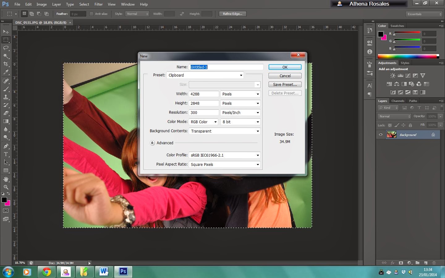
 In this image, I am removing the background by using the Magic Wand tool and the Ctrl + Del to clear out the green screen.

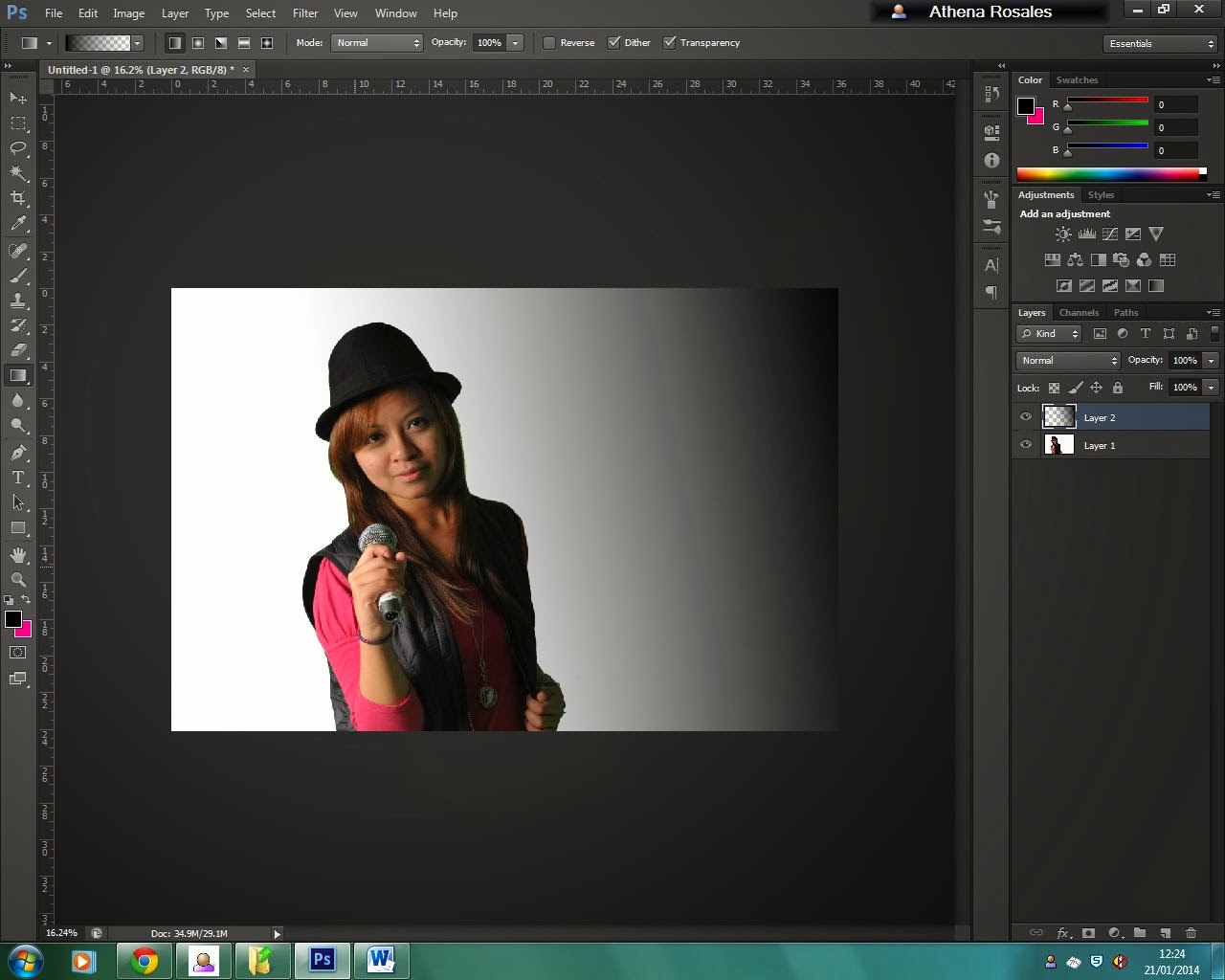
In this image, I had added in the background colour which is light grey by using the Paint Bucket Tool. I also used the Gradient tool to create an artificial backlight.

In this image, I used the Elliptical Marque and used stroke to create a pink light effect on the microphone. I also adjusted the opacity.

In this image, I used the Elliptical Marquee and used fill to create artificial camera flares. I also adjusted the opacity.

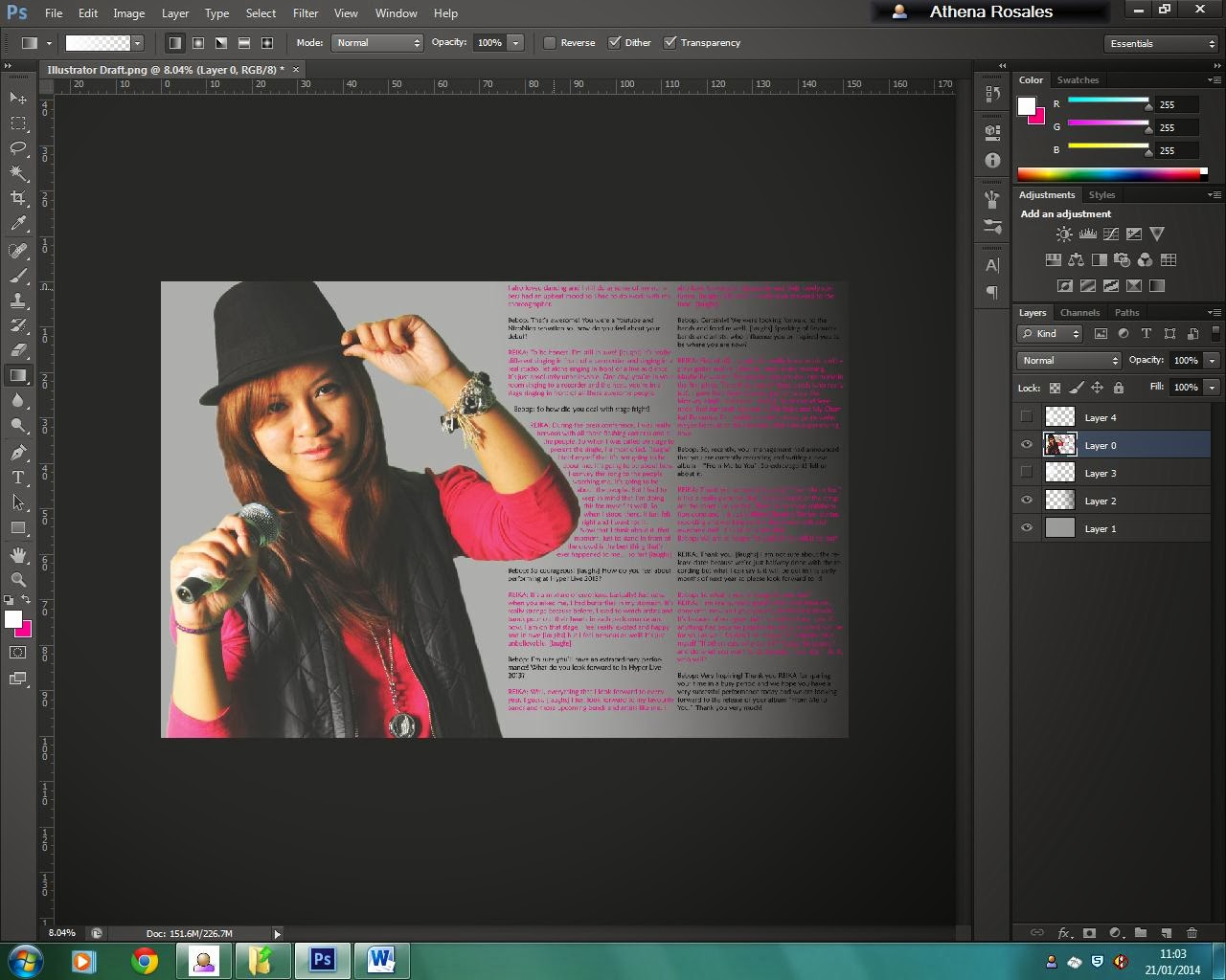
In the draft cover that I made, I just have to replace the layer with the central image to my edited picture.

And this is the outcome.
 This is my final cover for my Bebop! Magazines with the improvements and feed backs taken in consideration.
Media Used: Adobe Photoshop CS6


In this image, I had added in the background colour which is light grey by using the Paint Bucket Tool. I also used the Gradient tool to create an artificial backlight.

In this image, I used the Elliptical Marque and used stroke to create a pink light effect on the microphone. I also adjusted the opacity.

In this image, I used the Elliptical Marquee and used fill to create artificial camera flares. I also adjusted the opacity.
In the draft cover that I made, I just have to replace the layer with the central image to my edited picture.
And this is the outcome.
Subscribe to:
Posts (Atom)